In the current AIDA schema there isn't an easy way to handle and graphically represent a collection of data points with associated errors; especially when it is required to know the exact value of the point and when the errors are asymmetric (The binning of IHistograms will hide the value of the point and will not allow for asymmetric errors along the IAxis).
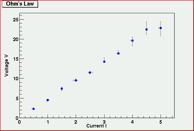
Some physics students in an undergraduate lab measuring the current I running across a wire for different voltages V to check if Ohm was actually right. They take 10 sets of measurements (I;V) with relative errors (eI;eV). What they would like to see is the following plot:
and be able to perform a fit with a straight line.
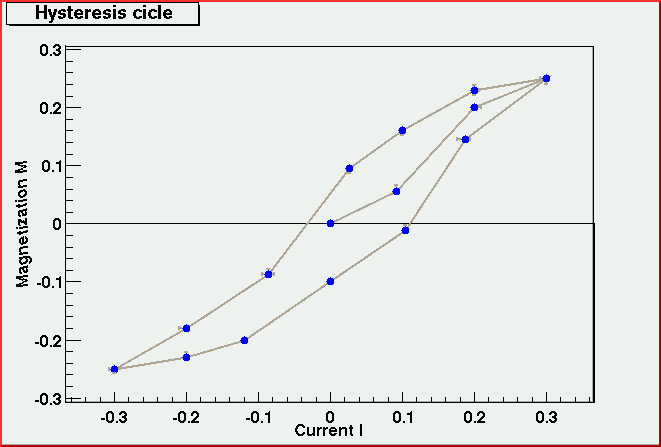
The same students have now a magnetic material wrapped in a coil of wire and want to measure how the magnetization M changes with the current I running in the wire. What they need to pass the lab is something like:
This type of plots can be also used to represent likelihood contours in the case of unbinned likelihood fitting.
Version: $Id: xyDataProposal.shtml,v 1.6 2002/03/26 02:52:15 tonyj Exp $